Doodle & Flow Challenge - Elaborate Scribble BirdsThis practice is a fancier version of the Doodle & Flow warmup game that I love (called Scribblebirds). You can choose to create your scribble birds to mimic real life birds or to be totally fantastical. Add color and flair to make it fun – you could even think of this as a Bird Boxes game (see the video in this playlist) and add more flair to each row of birds.
Remember: it is about process, not product. This practice exists to help you rest your mind and play!
0 Comments
Doodle & Flow Challenge - Dance Party This practice was inspired by a challenge set forth by someone on Instagram who said, “make your people move!” So, I did. And now you should too.
This is a multiple choice practice. You can draw different people doing different dances (like I did) or a dance team or a ballroom full of dancers. It is up to you. You can add sparkle and swoosh lines to give the people a sense of movement. Dance with your markers (or stylus, which doesn’t sound nearly as fun). Doodle & Flow Challenge - Curly-Q ParadeThis weekend’s challenge is a practice that I have been playing with for literally decades. The practice is a mindful meditation that builds from a center spiral. I try to fill the space efficiently without worrying too much about the composition. It always looks cool when you’ve filled a page with round, spiraling, colorful doodles.
Allow yourself to get lost in this doodle. Add shadows and color if you like, but I often leave mine black and white. These are among the most fascinating doodles to share. Please tag @angiebmoline and #doodleandflow if you share these on Instagram, Twitter or Facebook. Happy (mindful) doodling. Doodle & Flow Challenge - Bodies with FlairThis practice invites you to create diverse, glorious people who have personality and flair. It was inspired by clients giving me feedback that it is important to see themselves represented in my doodles when I draw for groups.
Remember: Doodle & Flow is about insight, not art. Color and flair are fun and allow your mind to rest and play while you're thinking / feeling / working through big ideas. Don't get too caught up in the beauty of it - think of this as your creative playtime. www.doodleandflow.com
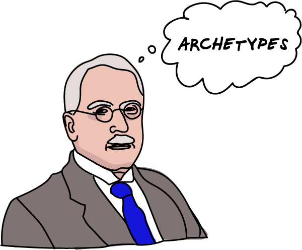
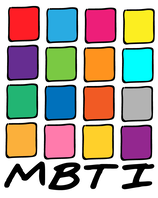
Does it help to know your type? The notion of personality preferences is not controversial - we all have our likes and dislikes - but the notion that we fit into a "type" or a "style" is controversial because it suggests that once I know your type, I can make predictions about you. It means that I can suggest what kind of world where you should live, work, and love in order to optimize your happiness and productivity (1). People also resist personality typing because it means that they should fit into a box drawn by a dead white guy. (It's worth noting that MBTI was created by a mother-daughter team and they had no training in psychology Academics hate it for that reason too!) Nonetheless, tests of styles, and types are very, very popular - especially in business, education, and fashion magazines. There are tests for management styles, learning styles, attachment styles, productivity styles, conflict styles, leadership types, and so many more. The idea that once you know your type or style, you can tailor your life to match it is big business!
References & Resources
Visual Inspiration - David Byrne's Arboretum I have fallen in love with drawing trees. There is a Doodle & Flow practice in the Find Your Joy miniCourse that asks you to draw trees. Most of the time when I draw trees, I show what the world sees above ground and what they don't see below ground. As an introvert, I have a rich interior life that other people don't see... some of them intuitively sense it, but it really isn't visible. Oftentimes my inner world isn't even visible to me until I draw it. Other times, I draw what brings joy and happiness to my life (above ground) and what I must do to nourish and sustain those things (below ground). Here's a sample: 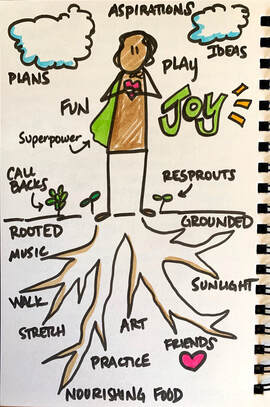 My inspiration for drawing trees comes from singer / songwriter / creative human David Byrne's book Arborteum. I found the book years ago while browsing the shelves of Powell's Books in Portland. I was teaching experiential education at the time and was doing a lot of doodling and journaling to cope with the intensely social experience of living and working with other people 24/7 for 100 days in a row. The brief glimpse at Byrne's book - drawing what we see above ground and what lurks beneath - was a strong metaphor for my experience of being constantly around people but also feeling lonely and disconnected from them at the same time. My role as a professor on the field semester I was teaching had me constantly answering student questions, guiding them in their learning, and facilitating conversations, but couldn't connect with them as peers. So I felt lonely. After leaving the bookstore, I was sad that I hadn't bought the book, but my life moved on so I couldn't return to get it. Several years ago I learned that the book was reprinted and I quickly ordered a copy. It has become a favorite source of inspiration... not only does Byrne let his mind wander throughout his sketchbook but he invites us to look at what grows there - above and below ground. A few pages from Arboretum: 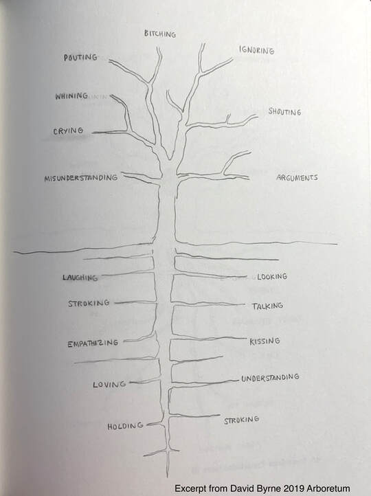 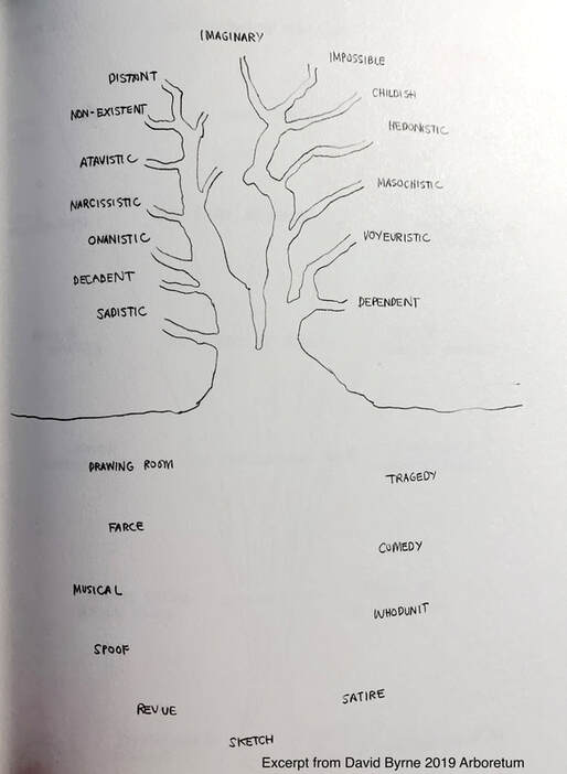 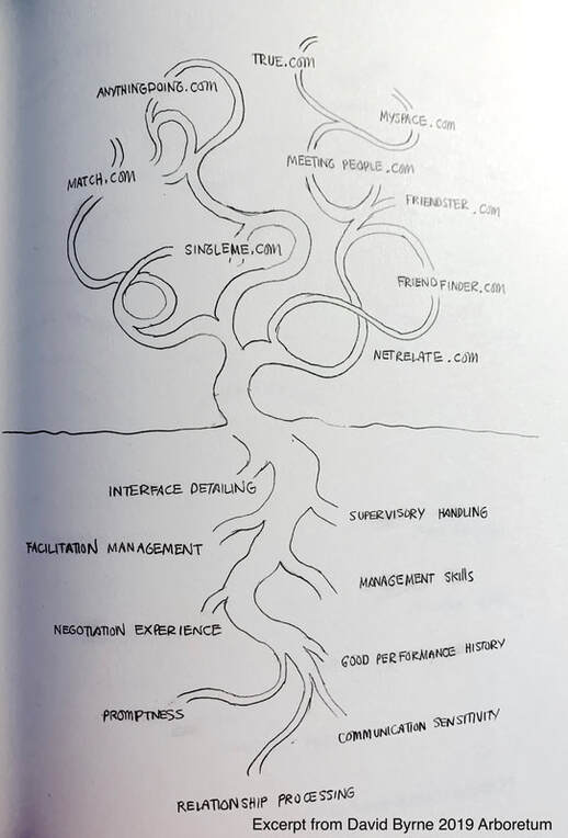 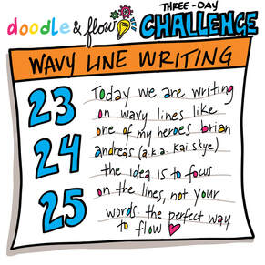 This weekend's challenge is inspired by one of my doodling heroes - Kai Skye (a.k.a. Brian Andreas) - who says that sometimes when he needs inspiration for writing and doodling he does this. Day 1: Wavy Lines Using a pencil, gray marker, or fine pen, draw a series of parallel lines on a page with your non-dominant hand (we want them to be wavy). You want to see these but they shouldn't overwhelm the page. Think of this as a meditation, not a drawing exercise. Day 2: Flair Slowly fill in these lines with words that come to you. Use a bigger, darker marker for the letters. Write slowly and deliberately. It is okay if they don't make sense. Think of this as a meditation, not a writing exercise. Day 3: Doodles Color in any letters that make a closed shape - like the middles of A, B, D, P. You can use the same colors or alternate colors. Add doodles around your writing. Draw anything that comes to mind for you. Share a photo of your doodle on social media and in the Doodle & Flow online community! Hashtags: #doodleandflowpractice #flowersandvines #molinecreative
It's about insight, not art.  Doodle & Flow is a process that is designed to put you in a "flow" mindset and help you tap your intuition, your creativity by allowing your mind to wander, gently. The flow space allows your spontaneous brilliance to emerge, so please do not get caught up in the drawing and art-making of Doodle & Flow. This is about process, not product. Allow yourself play and see what arises!
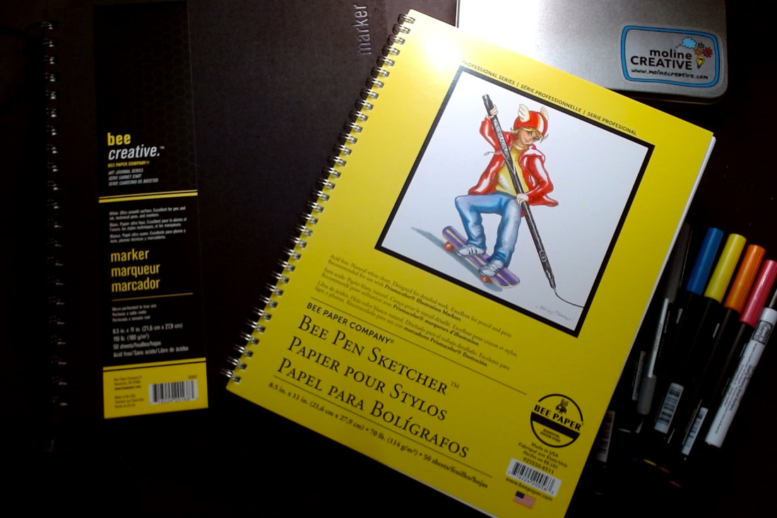
I'm guessing if you're reading this post, you like the Doodle & Flow process enough to invest in fancier doodling supplies - or, like me, you have an art supply addiction. Either way, this is fantastic news. Congratulations!
Let me keep this brief. I use three main things in my practice: silky smooth marker paper, pigment-based black markers, and colorful watercolor markers. I also carry my markers in a neat little case and sometimes use Avery labels to cover up my mistakes. Paper: Spiral bound, smooth, thick, perfectly white pages I have tried dozens of types of paper and I will write a review about the pros and cons of all of them at some point, but I like spiral bound blank sketchbooks when I draw with markers. I like them because I am often doodling on my lap and I never know how to manage the other side of the sketchbook if it is hard bound. I also like thick, smooth, perfectly white paper. I like thick paper so my markers don't "ghost" or show up on the next page. I like smooth paper because it uses less marker ink. I like perfectly white paper so I can use labels to cover up my mistakes. My favorites:
Black Markers: Pigment-based twin tips I wrote a whole blog post about my marker trials. I bought dozens of markers and tried them all! You can check my review here and my recommendation here. Briefly, I settled on Uchida Pigment-based Artist Markers. I like them because they dry fast, don't smear, and (most importantly) don't smell toxic to me. I also like that they have two nibs - skinny and thick. I don't like that they are expensive and seem to run out of ink really fast. Colorful Markers: Water-based brush tips I go back and forth between Tombow Dual Brush Pens and Neuland Fine Liners (brush tip). I like the dual tip feature because I mostly use my colorful markers for coloring, but occasionally I use the fine nib to write text. I like the water-based ink because it isn't toxic. If I am traveling and can't find Tombow markers, I will sometimes buy the generic Artist Loft version from Michaels. I don't like them quite as well because they aren't as juicy as the Tombow markers, but they work in a pinch. They are also a tiny bit shorter so they fit in smaller pen cases. Avery Labels: The littlest ones I also use sticky labels - the white ones you use to put on envelopes for mailing - to cover up my mistakes. My two favorite sizes for Doodle & Flow are 60 and 80 labels to a page. This challenge is designed to be completed in tiny little chunks (5-10 minutes) over seven days, but as with everything in Doodle & Flow, complete it at your pace on your timeline. Feel free to string it out over seven weeks or binge it in seventy minutes. It is your practice. Do as you wish. 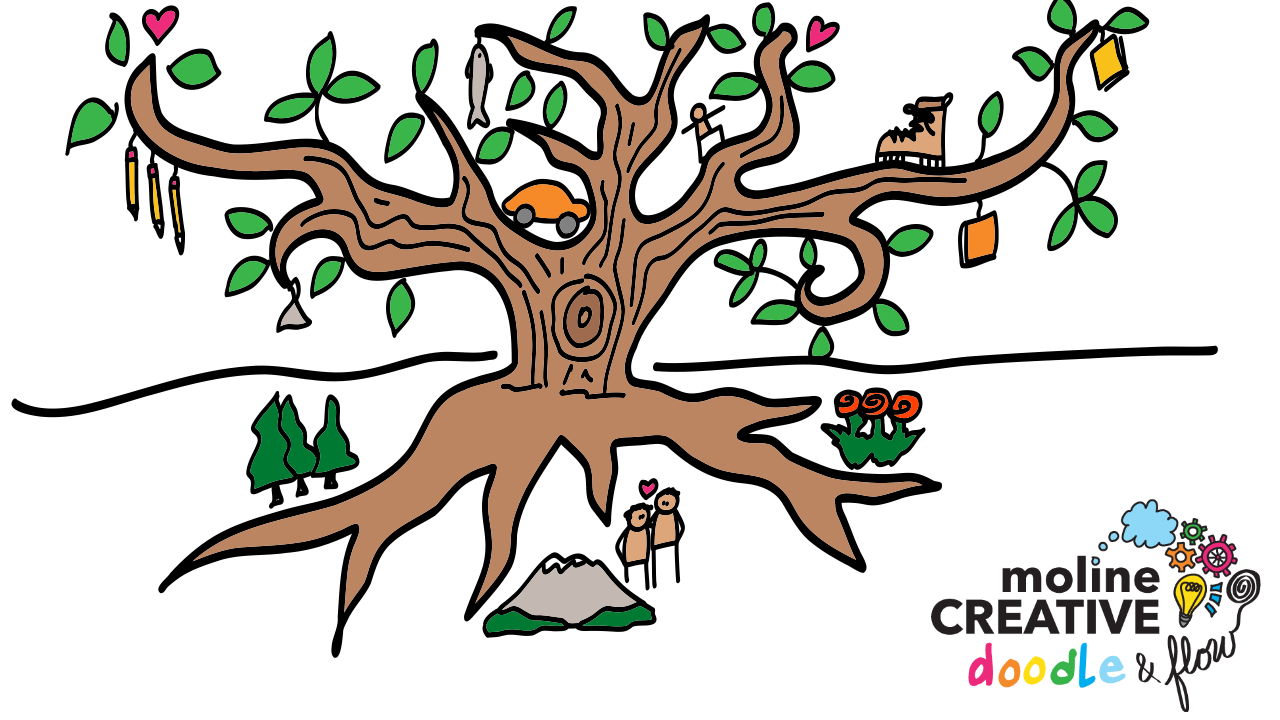 Day 1: Your & Doodle Your Life Brainstorm major events from your life (in words). You can write a list, paragraphs, or just keywords - don't worry about spelling or grammar. Now, draw quick, rough sketches / doodles to represent each of the events from your life (you'll use these later) Day 2: Doodle Your Tree Draw the trunk, roots, and branches of a wild and rambling tree. Leave lots of room on the page (between branches / roots) to add more details. Use permanent black ink. Day 3: Decorate Your Tree Add the items from your life to the branches and roots of the tree in permanent black ink. Consider where these items fit:
Day 4: Color Your Tree Color the tree and the items you added. Consider the distribution of color across the page. Sometimes when coloring the objects, I step back and fill in all of the yellow bits at once so I have yellow distributed across the page not all clumped together. Other times, I just color from one side to the other and see what falls out. Don't overthink it - just follow your intuition. Day 5: Add Flair Go back into your doodle and add flair to the items from your life. Flair means color, sparkle lines, shadows, patterns. Also add things outside the tree that you aspire to experience, achieve, attain. Just doodle the essence of these items... maybe a heart for love or the sketch of a map for a place you'd like to visit. Day 6: Observe Your Tree & Yourself Take time to sit with your tree of life. Hang it on the wall. Look at it with a relaxed mind for 5 minutes or so. Hold your blankbook and a marker in your hand while you look. Reflect on the highs and lows. Make notes of what you observe in your tree of life. Ask yourself questions that you will answer tomorrow. Day 7: Reflect on the Process
Share a photo of your doodle on social media and in the Doodle & Flow online community! Hashtags: #doodleandflowpractice #flowersandvines #molinecreative
It is about insight, not art.  Doodle & Flow is a process that is designed to put you in a "flow" mindset and help you tap your intuition, your creativity by allowing your mind to wander, gently. The flow space allows your spontaneous brilliance to emerge, so please do not get caught up in the drawing and art-making of Doodle & Flow. This is about process, not product. Allow yourself play and see what arises!
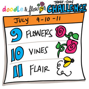 Day 1: Flowers Draw a series of slightly wobbly spirals that will become simple roses... or you can draw any other type of flower. This is about the process, not the product. Draw whatever brings you joy. Day 2: Vines Add vines. Consider adding curls to your vines and working out what it looks like when the vine winds around itself (it appears smaller as it moves away from you). Day 3: Flair Add color to your vine and consider adding flair like grapes, flowers, bugs, bees, birds. Share a photo of your doodle on social media and in the Doodle & Flow online community! Hashtags: #doodleandflowpractice #flowersandvines #molinecreative
 Doodle & Flow is a process that is designed to put you in a "flow" mindset and help you tap your intuition, your creativity by allowing your mind to wander, gently. The flow space allows your spontaneous brilliance to emerge, so please do not get caught up in the drawing and art-making of Doodle & Flow. This is about process, not product. Allow yourself play and see what arises!
|
Categories
All
Angie B. Moline
Dr. Moline is an ecologist and visual process facilitator who draws pictures to help clients think. She is currently on a quest to understand why live drawings are so compelling and how to make them as sticky as possible in order to improve communication, understanding, and memory. Follow here journey here! 
|
 RSS Feed
strategy
innovation
Communication
Clients & Case Studies
philanthropy
ABOUT US
|
|

