Visual Inspiration - David Byrne's Arboretum I have fallen in love with drawing trees. There is a Doodle & Flow practice in the Find Your Joy miniCourse that asks you to draw trees. Most of the time when I draw trees, I show what the world sees above ground and what they don't see below ground. As an introvert, I have a rich interior life that other people don't see... some of them intuitively sense it, but it really isn't visible. Oftentimes my inner world isn't even visible to me until I draw it. Other times, I draw what brings joy and happiness to my life (above ground) and what I must do to nourish and sustain those things (below ground). Here's a sample: 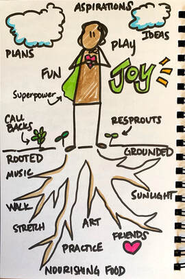 My inspiration for drawing trees comes from singer / songwriter / creative human David Byrne's book Arborteum. I found the book years ago while browsing the shelves of Powell's Books in Portland. I was teaching experiential education at the time and was doing a lot of doodling and journaling to cope with the intensely social experience of living and working with other people 24/7 for 100 days in a row. The brief glimpse at Byrne's book - drawing what we see above ground and what lurks beneath - was a strong metaphor for my experience of being constantly around people but also feeling lonely and disconnected from them at the same time. My role as a professor on the field semester I was teaching had me constantly answering student questions, guiding them in their learning, and facilitating conversations, but couldn't connect with them as peers. So I felt lonely. After leaving the bookstore, I was sad that I hadn't bought the book, but my life moved on so I couldn't return to get it. Several years ago I learned that the book was reprinted and I quickly ordered a copy. It has become a favorite source of inspiration... not only does Byrne let his mind wander throughout his sketchbook but he invites us to look at what grows there - above and below ground. A few pages from Arboretum: 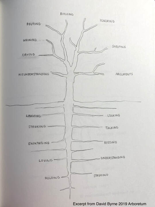 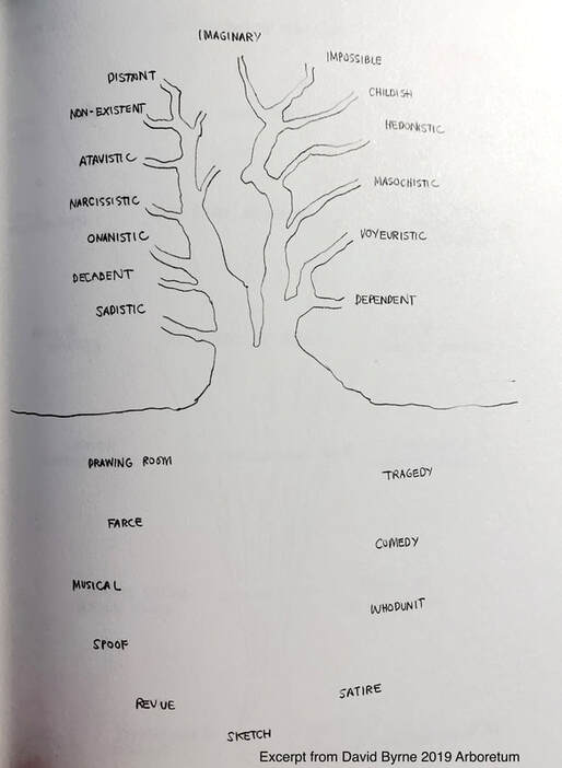 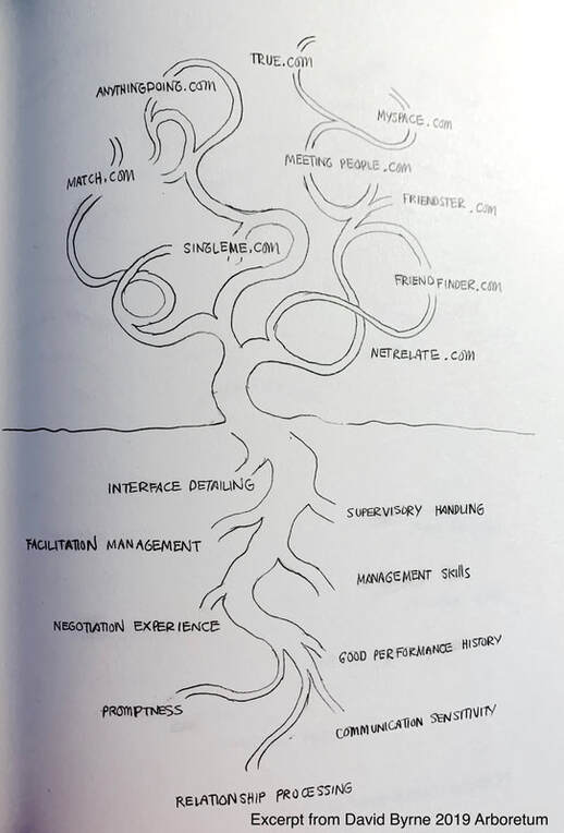
0 Comments
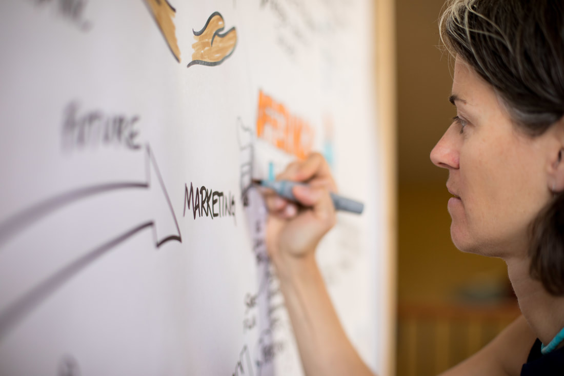
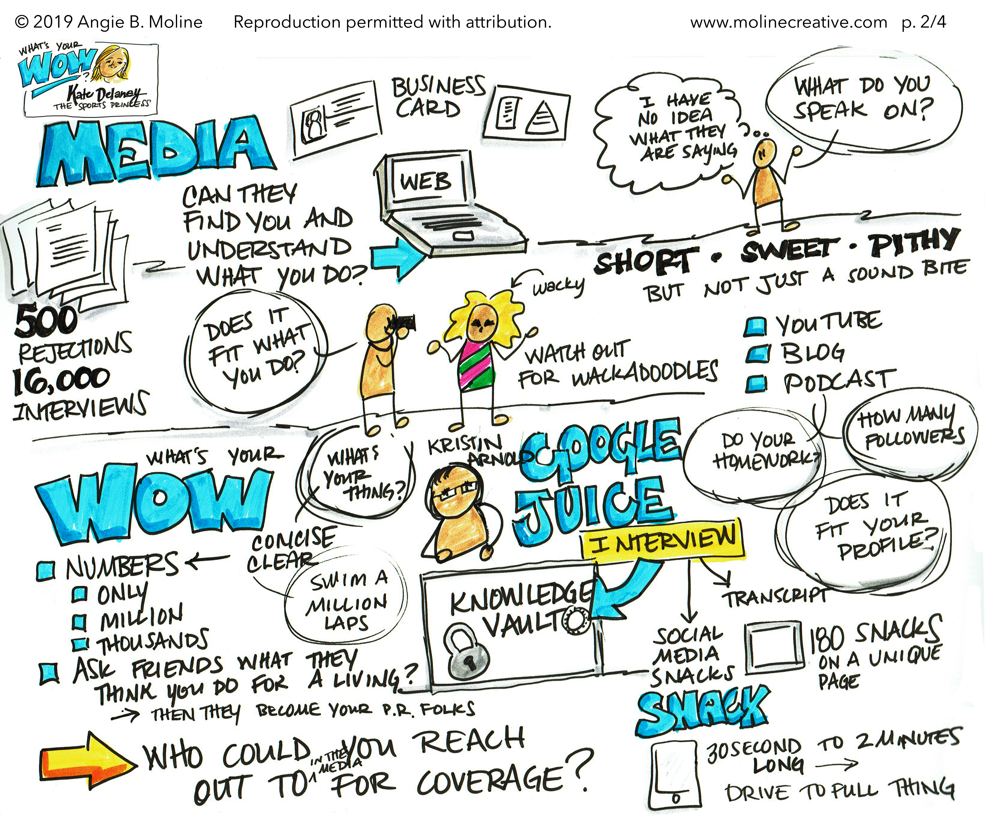
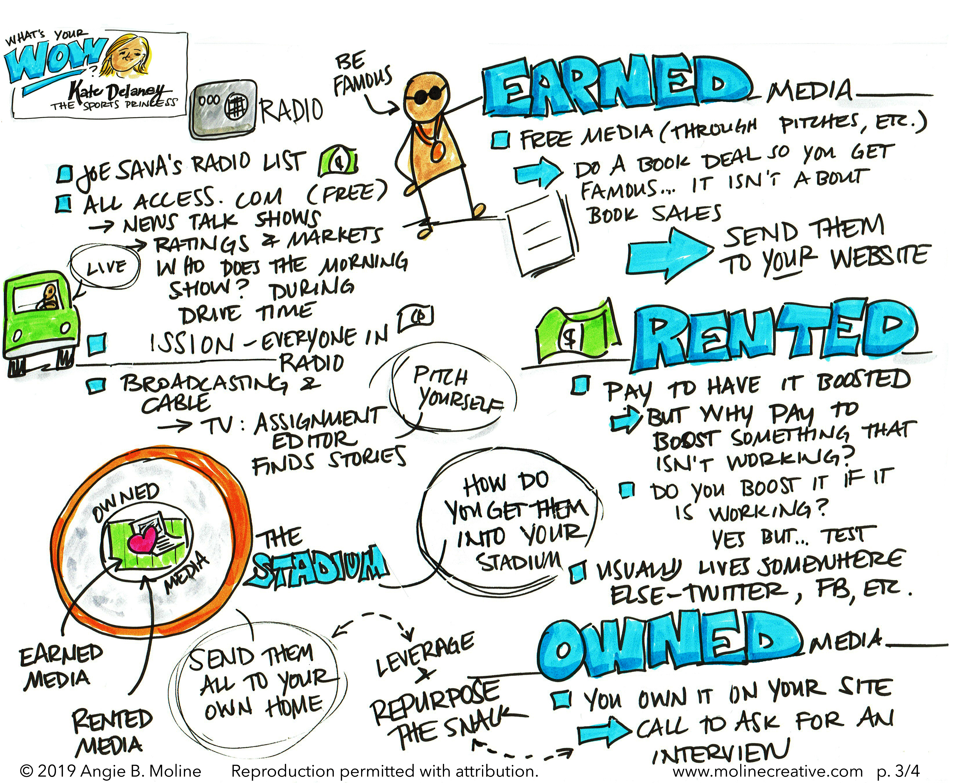
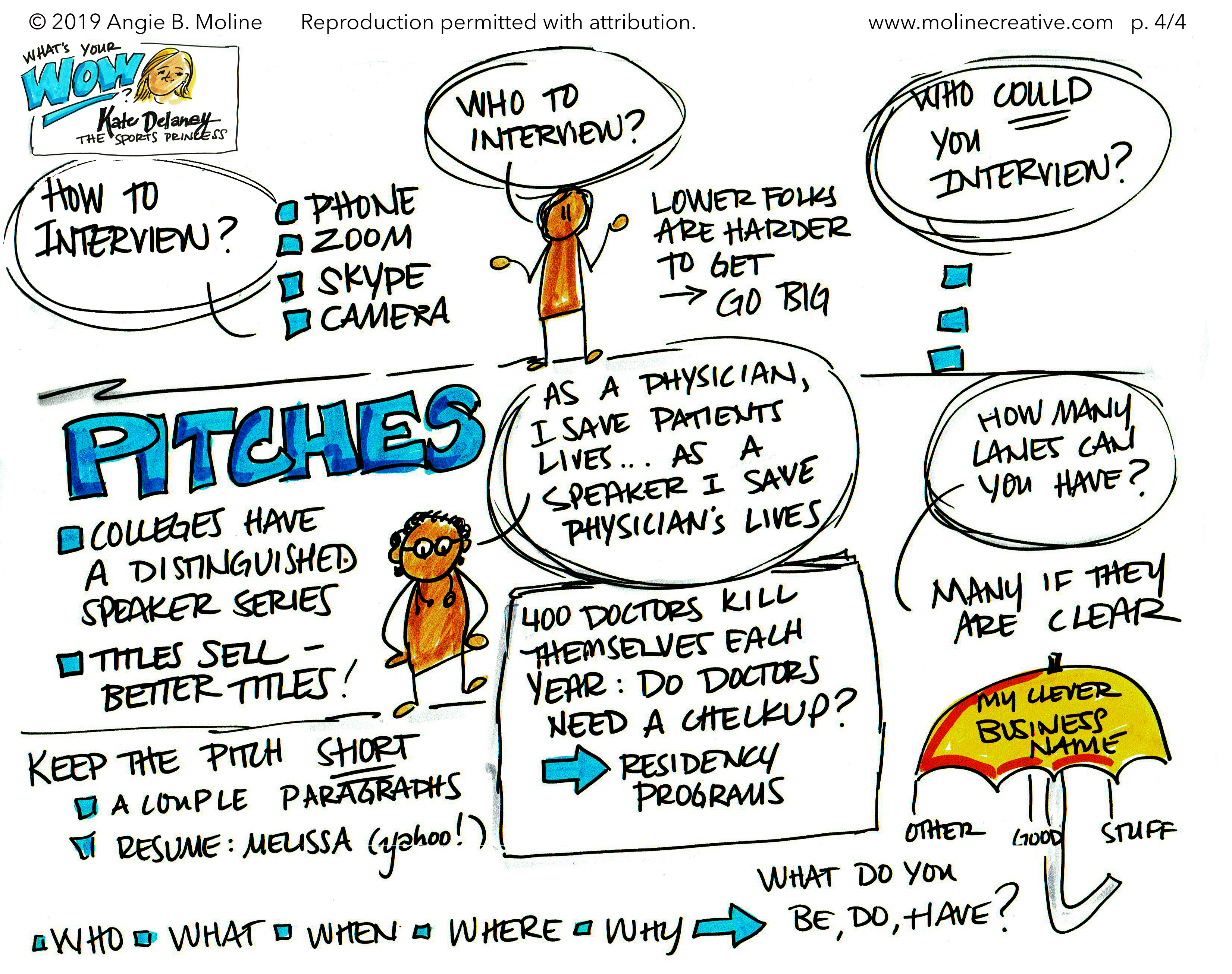
Have you woken up in the middle of the night because your mind was racing through your busy to do list? And then drifted peacefully off to sleep after you wrote the list on a notepad beside your bed? If so, this post is for you... I have been keeping a journal, diary, or sketchbook for the past 30 years. Over that time, I've learned to use doodling and writing to shift the speed of my thinking depending on what life requires of me. There are times when my brain is moving slowly and I can't get motivated to work on a writing project, so I sketch out what I am going to say - not outline what I am going to say, but doodle a picture of what I am going to say - and my mind warms up Other times my mind is racing so fast that I can't think deeply enough to solve a client's problem, so I clear the chatter by writing quickly or making lists. I use this process, which I call Doodle & Flow, daily to meet life's challenges. Recently I have started sharing the process of Doodle & Flow with colleagues and friends. Because much of my own learning has come from personal writing, that's where we're starting. Together we are building a community of creatively curious people who want to shape their own thinking to quickly generate new ideas, thoughtfully consider their lives, cultivate stronger relationships, and live intentionally. I can't wait to share the doodles that these amazing humans are creating and the insights that are emerging for them. Stay tuned for Doodle & Flow... coming July 20th. Sign up to receive Doodle & Flow warm up exercises, doodle challenges, and info about new courses. 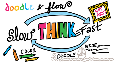 I was invited to draw for the Conscious Capitalism Stakeholder Event in Phoenix in May. Ten Conscious Capitalists from around Arizona shared five-minute stories of building connections among businesses, universities, suppliers, customers, and neighbors. Some stories were funny and others were heart wrenching, but all were worthwhile! Each of the talks was too short to capture completely, but these highlights show the network of businesses that make up Conscious Capitalism AZ. 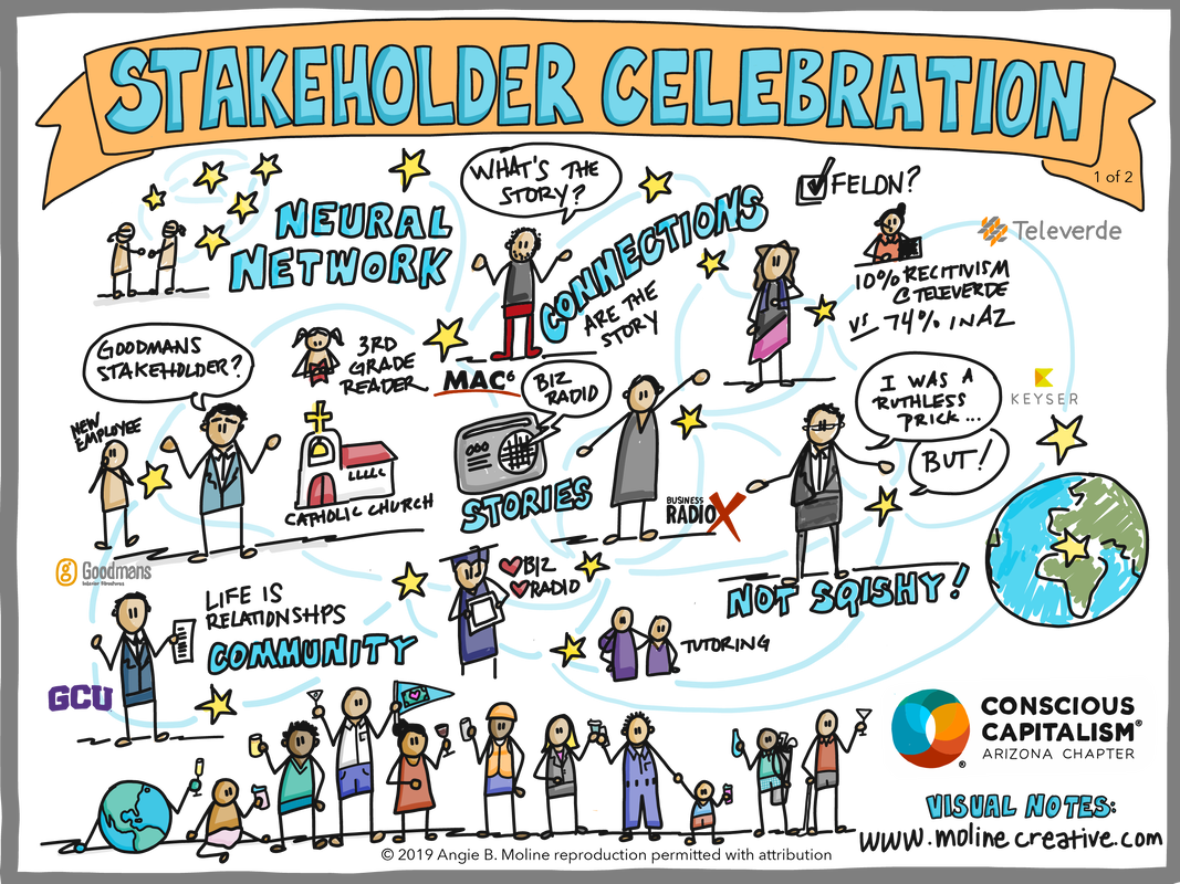 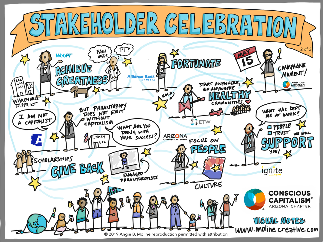 It seems like everyone I meet these days is talking about the NSA - National Speakers Association - so when past president Kristin Arnold invited me to attend the Arizona Chapter meeting this week, I went for it! Kate Delaney, the Sports Princess, spoke about finding your WOW. I would boil her message down into these essential elements:
My visual notes of Kate Delaney's talk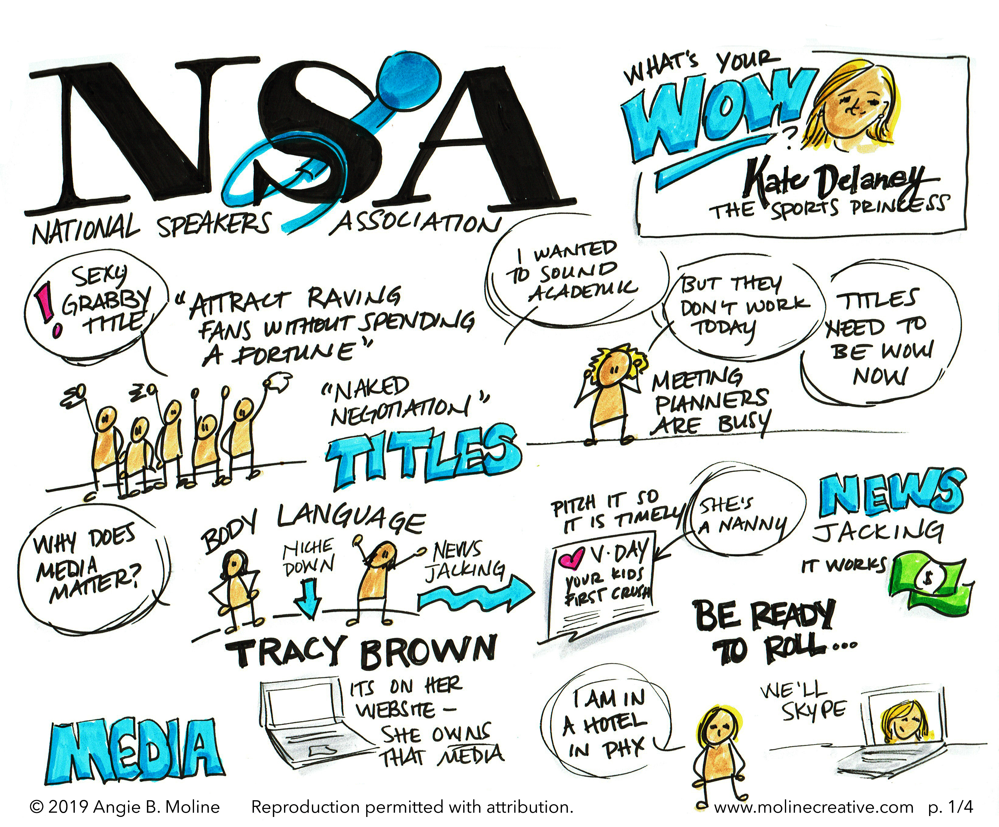
So, does this make me a “visual learner”? When people talk about learning styles, they often refer to people who prefer to learn from visual information (i.e., drawings, photographs, diagrams, and illustrations) and people who prefer to learn from verbal information (i.e., spoken words, written stories, and text-based instructions). Hence the suggestion of two learning styles: “visualizer” and “verbalizer”. These two styles have received a lot of attention from academic researchers, parenting journals, and Facebook quizzes, but they are only two among dozens of learning styles have been described over the years (e.g., Myers-Briggs, Kolb’s Learning Styles, Gardner’s Multiple Intelligences, etc.). It seems to give people reassurance when they believe they know how they learn best. Parents are also drawn to the idea that if their children are taught in their preferred learning style, they will do better in school and go on to live more successful lives. However, the science suggests that it is not this simple (1).  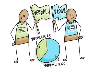 Educational psychologists have documented that people do indeed prefer visual or verbal information and to some degree these preferences are related to their cognitive ability with visual or verbal information (2). Scientists determine someone’s preference by giving them a quiz that asks questions like: “when you read science lab manual, do you prefer to look at the diagrams or read the text?” Once they know a person’s preferred style, they can validate that preference by offering them the choice of multiple types of information (i.e. diagrammatic or text-based help on a quiz) and determining if their choices match their preference (1). Once researchers demonstrate that people reliably prefer one type of information over another, they need to figure out if people learn better in an environment that emphasizes the type of information that they prefer (3). This distinction – switching from identifying the information I prefer to the information that helps me learn – is what separates a learning preference from a learning style. Researchers call this the “meshing hypothesis” and is the most common way to test for the existence of learning styles (4). 
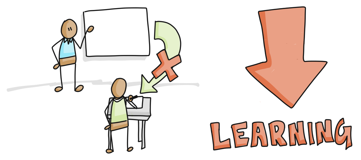
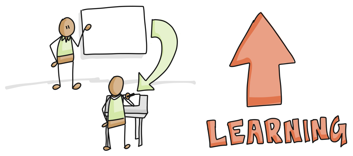
Tests of the meshing hypothesis have come up empty-handed. Students do not score better on quizzes after they have been taught in their preferred style (5, 6). In one study, the researchers found that all learners performed slightly better on a quiz about lightning formation when they were presented with visual information, regardless of their learning preference. It seems that students can adapt to accommodate any type of information presentation. While there is not much scientific support for the meshing hypothesis, there is support for the idea that the teaching method should match the content being taught (7). For example, how effective would it be to teach:
The idea of learning styles is very compelling because it speaks to our human desire to understand ourselves and be understood. However, it is important to understand the difference between preferring visual information and learning more effectively from visual information because if you believe too strongly that you need visual information to learn, you could miss out on a lot of exciting ideas that are best described in only in words! Resources & References
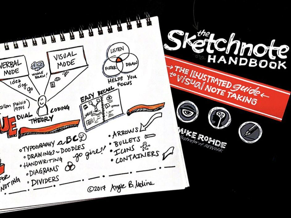
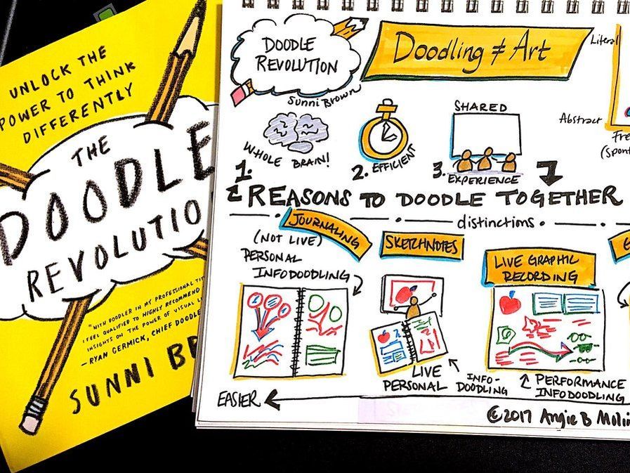
People who see Moline Creative work live, either working as a visual process facilitator or a visual note-taker, often ask how they can learn these skills. I always recommend these two AMAZING books for people who would like to work visually:
I have included links to purchase these books from Better World Books (a super cool online used - and new - book retailer), but you can purchase them everywhere wonderful books are sold.
VISUAL COMMUNICATION IS NOT ART. IT'S FASTER THAN ART You already know how to speak a visual language. When you were a small person, you recognized faces before you knew names. Then later, you probably started drawing before you wrote letters and words. Now you are able to fluently read faces, facial expressions, icons, logos, maps, and a thousand other types of visual language without thinking too much about it. As I just said, you are already a visual communicator. However, many adults feel that they have lost touch with their ability to speak a visual language because somewhere along the way they were forced to make a choice between being an "artist" or not being one. Most of us chose the second option. Visual communication conveys the essence of your message in drawings, sketches, icons, or clip art. If you've ever played the game Pictionary, you know that the drawings don't have to be pretty to get your message across! If you want to learn to work visually, you must set aside your inner art critic - or send her to the Met to critique works by the masters. ;) When you are starting to work visually, the most important thing you can train yourself to do is find the essential points of a story. Once you have these points, you can determine how you'll visualize them and where you need to add lines and arrows to help your audience follow your thought train. After you have those basics down on paper, you can make the presentation a bit prettier by adding color and flair.
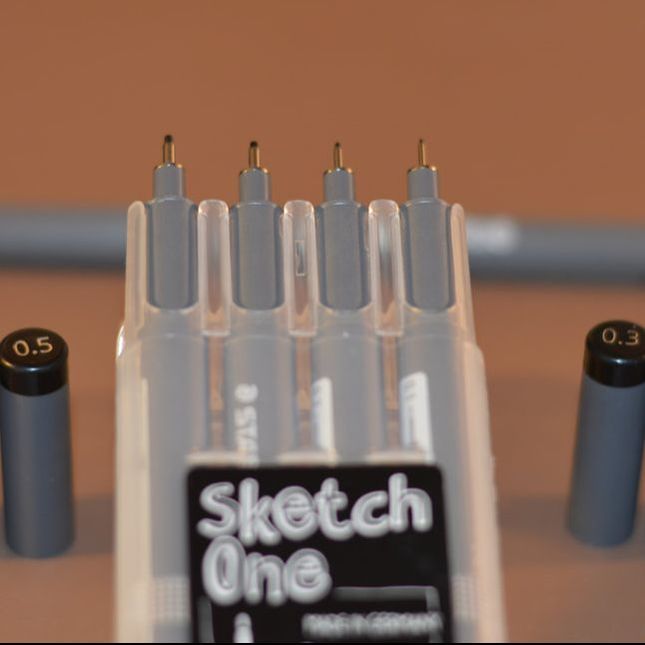
CHARACTERISTICS OF THE PERFECT PEN
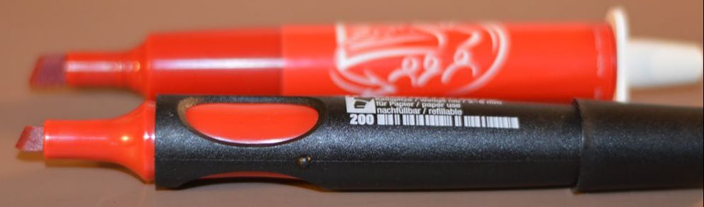
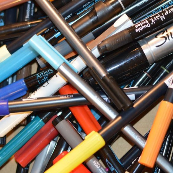
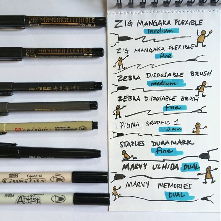
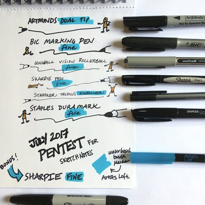
Smearability. I like to draw black outlines and then quickly add shadows and color fills. Because I like to work quickly, the black outlines are not always dry when I add color. If I add yellow on top of black, I can sometimes get some wicked smears that make everything look murky. There are several types of black markers, but a few common ones are alcohol-based ink, water-based ink, and pigment ink. My experience is that the alcohol-based ink (i.e. Sharpie, Bic Marking Pen, Prismacolor, Copic markers) smear the least, water-based markers smear the most, and pigment-based markers are in the middle. I did an extensive black pen test to find the least smeary black marker.
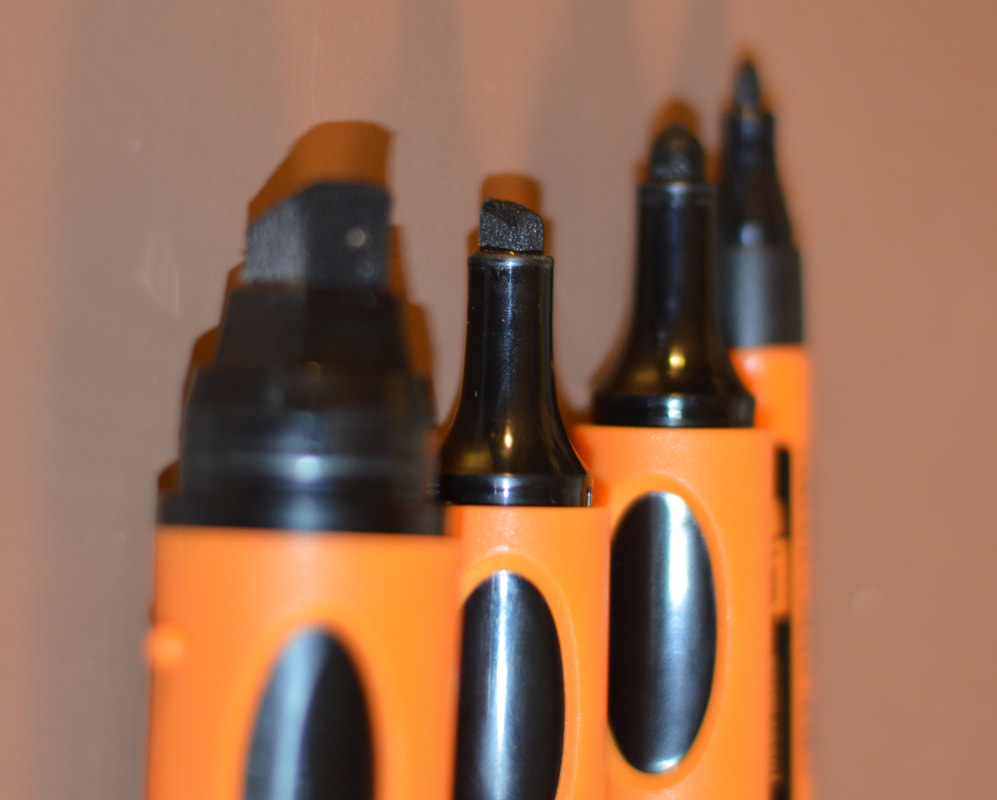
Toxicity. While the alcohol-based markers are fantastic in the variety of nibs and non-smear categories, they are terribly stinky and feel toxic to me. They also bleed through the page. I occasionally use Sharpies to draw sketch notes, but not often because they make me nauseous after about 15 minutes. I gave all of my Prismacolor markers away because I couldn’t even tolerate them for 10 minutes. If you can tolerate the stink (or work in a well-ventilated space), graphic designers and illustrators LOVE Copics and Prismacolor markers. Sustainability. Most markers are disposable. You throw them away when they run low. Some markers are refillable, but these are rare. Water-based markers are probably the most environmentally friendly option because they are non-toxic. The downside of water-based inks is that they are not as archival as other markers (they fade in sunlight). Cost. If you are drawing sketch notes, you probably won’t go through markers so fast that cost is going to be a big issue. I draw about 50 square feet of sketch notes each month and I go through about 1 black marker and 1 color marker each month (on average). However, if you draw a lot of large wall charts, it adds up. You can shop around to find the best deals on markers and pens (because different places have different sales at different times). I buy markers at my local art stores and also shop at DickBlick.com JetPens.com Neuland.com and Amazon.com. PERFECT PEN RECOMMENDATIONS: WALL CHARTS Black outlines. My go-to markers for black lines on wall charts are Neuland Outliners. Period. They are just amazing markers. I love that they are refillable and non-toxic and don't smear. Honestly, I do not know how they do it, but the Outliner ink is amazing. It reminds me of India Ink (and may be!).
Colorful markers. I alternate among a few types of markers for wall charts, but will only discuss a few here. If you don't want to order fancy markers, you can get a lot done with three types of water-based markers that are available at most office supply stores: Crayola Multicultural Markers (for coloring people), Sharpie Flip Chart Markers, and Mr. Sketch (a.k.a. smelly markers). The Sharpies and Mr. Sketch are easy to find in bullet nibs, but search for chisel nibs because I have seen them.
 Everyone has personal preferences when it comes to art and office supplies. Try a few things out and let me know how it goes!
WHY SCIENCE NEEDS ART (AND VICE VERSA) When I was a young girl, I was told that I was "gifted" at math and science. Then I was told that I had a moral obligation to pursue a career in a STEM field... twenty-five years later, I started to wonder if this was true. I presented this PechaKucha style talk last night at Dark Sky Brewing for the Flagstaff Mountain Film Festival. I re-recorded it and (lazily) animated the slides for this version. Flagstaff Mountain Film Festival 2018: 15 by Flagstaff By: Angie B. Moline |
Categories
All
Angie B. Moline
Dr. Moline is an ecologist and visual process facilitator who draws pictures to help clients think. She is currently on a quest to understand why live drawings are so compelling and how to make them as sticky as possible in order to improve communication, understanding, and memory. Follow here journey here! 
|

 RSS Feed
strategy
innovation
Communication
Clients & Case Studies
philanthropy
ABOUT US
|
|

